top of page
EMMA LAFLECHE DESIGN & PHOTO - Personal Branding
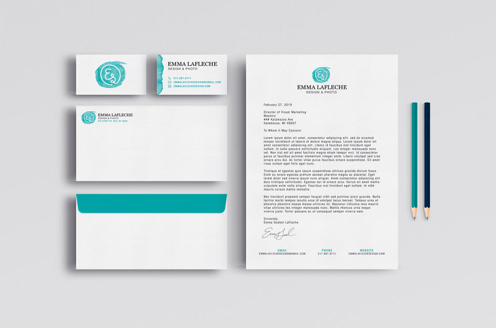
For my personal logo I chose Marion and Helvetica Neue as my typefaces because I enjoy mixing thin serif and sans-serif typefaces in my designs. In addition, I elected to include a circle shape within my logomark because it can be loosely associated with the moon, which is a personal connection to myself. I see myself in the moon, I was born during a full moon, and I even have a tattoo of a full moon on my ankle. On a different note, I chose to include an organic watercolor mark to allude to my more traditional art side.
bottom of page


